

Finding a walk-in appointment on short notice can be difficult, with family clinics often fully booked. Quickly locating available walk-in clinics becomes stressful and time-consuming. An example of this is a parent who has received an unexpected call from school or daycare about a sick kid.
After a doctor’s consultation, obtaining prescribed medications presents another obstacle. Prescriptions typically require a physical drop-off at the pharmacy always necessitating multiple trips to the pharmacy.
This is a widespread issue in Alberta, impacting not only parents but also young adults and workers. Streamlining this process could bring much-needed efficiency and convenience to many. As a parent who has faced this challenge firsthand, I was motivated to find a solution.
OVERVIEW
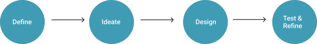
THE PROCESS:
DEFINE
To ensure the design effectively addressed real user needs, it was critical to engage with others to gain a deeper understanding of their experiences, pain points and preferences. This step was particularly important to mitigate confirmation bias, as my personal experience with the issue could unintentionally influence the design.
I conducted interviews with five participants to gather qualitative insights. The sessions included two in-person interviews and three conducted via Zoom, with each interview lasting approximately 30 minutes. This approach allowed me to explore diverse perspectives and uncover key themes that would inform the next steps in the design process.
2 out of 5 participants mentioned they encountered challenges when attempting to schedule an immediate appointment with their clinic.
All 5 participants encountered challenges in the process of booking appointments with other clinics nearby when unable to secure one at their preferred clinic, as not all clinics accommodate walk-ins.
All 5 participants mentioned that the process of obtaining a prescription from the pharmacy is time -consuming.
A participant expressed a preference for a female doctor during consultations.
EMAPTHY MAPPING (GATHERING INSIGHTS):
Distinct patterns became evident as I synthesized the insights gathered from the interviews through the application of empathy mapping. I went on to create a consolidated empathy map, highlighting the shared needs and challenges of the users.
USER PERSONAS
The insights gathered guided the development of two personas:
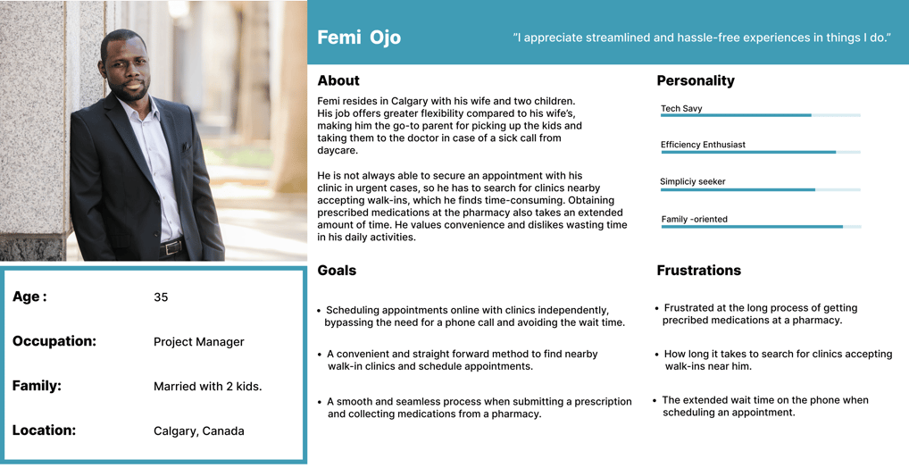

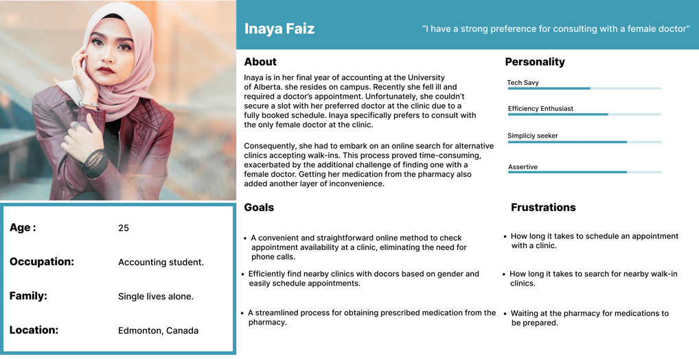

The design decisions were tailored with Inaya as the primary focus/persona. By addressing Inaya's needs comprehensively, the solution could effectively cater to a diverse user base. Inaya's persona guided the design process, I ensured that her requirements were consistently prioritized and referenced through out.
DEFINING THE PROBLEM STATEMENT:
Following the collection of insights and findings, I created a problem statement:
"Individuals experience significant frustration with the lengthy and inefficient process of securing clinic appointments, particularly when their preferred clinics have no availability. Searching for and booking walk-in appointments that align with specific preferences further adds to the challenge. Additionally, the process of obtaining prescriptions at pharmacies is widely perceived as overly time-consuming, compounding the overall inefficiency of accessing timely healthcare services."
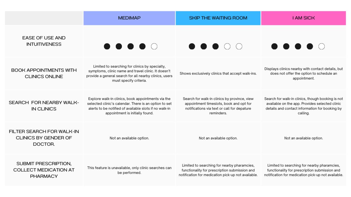
COMPETITOR ANALYSIS:
My next step involved exploring existing applications addressing the problem. This was essential to grasp the current market trends and aid in identifying potential gaps or opportunities.
I identified three direct competitors and conducted a thorough evaluation of these competitors based on the requirements outlined for the primary persona.

SITEMAP:
In designing the solution, I began by visually mapping out the hierarchy of content, pages, and features.


EARLY SKETCHES:
With the site map as a guide, I initiated the visualization of my design concept through sketches. Below is an iterative sketch crafted for the landing page.


HIGH - FIDELITY PROTOTYPE:
CHALLENGES:
Designing the application to be responsive across different devices and screen sizes, considering the constraints.
Designing an optimized booking flow that minimizes the number of steps to get things done within the application.
KEY TAKEAWAY:
As you can see, the final design has evolved significantly from the initial sketches. This evolution highlights the iterative nature of the design process—it is rarely linear, and each stage builds on the insights and feedback from the previous one.
Initial Sketches: These served as rough blueprints, focusing on the overall layout and user flow. They provided a starting point but were not detailed enough to address deeper usability concerns.
Low-Fidelity Designs: These added more structure and functionality, allowing me to test basic interactions and workflows. However, gaps were identified.
High-Fidelity Designs: As I transitioned to high-fidelity mockups, several changes were made to refine the design further.
All the changes made demonstrates how design is an iterative process driven by feedback, testing, and exploration.
WHAT'S NEXT:
CONCEPT VALIDATION (2): Due to time constraints, this step has not been conducted at the time of compiling this case study. However, it will involve gathering feedback from the same participants involved in the user interviews to verify that the proposed design solutions effectively address the identified issues and meet user expectations.
Upon receiving feedback, I will iterate on the design, integrating valuable suggestions and addressing any concerns raised during the validation process.


