HiHenrietta
Duration: 2 months
Role: Product designer (collaborated with another product designer in a product team).
Your healthcare, your way, one chat away.


Client: HiHenrietta
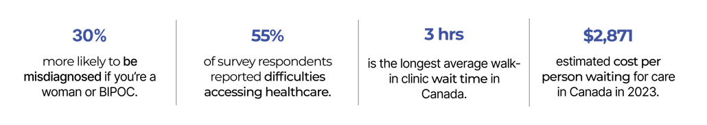
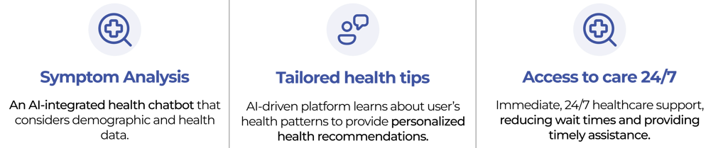
HiHenrietta is a concept for a symptom analysis app designed to help reduce unnecessary hospital visits and support Black patients in preparing for medical consultations. The product owner identified significant challenges faced by the Black community in North America, including biases in treatment, frequent misdiagnoses, and delays in care. These issues, combined with long wait times and a shortage of doctors, create barriers to accessing timely and quality healthcare. HiHenrietta aims to use AI to provide symptom analysis and guidance, offering a step toward addressing these challenges.
OVERVIEW:
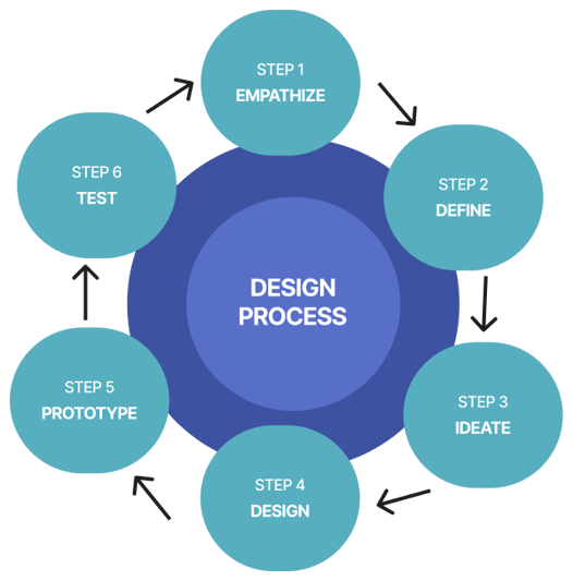
The goal is to design an MVP prototype to showcase the app’s potential before moving into development. This prototype would act as a proof of concept, demonstrating the app’s core functionality and usability. However, building an effective solution required a clear and structured approach. To achieve this, we followed a design thinking process—a framework that guided our journey from understanding the problem to creating and testing the prototype.
FROM IDEA TO MVP:
THE PROCESS:

Surveys were conducted with 47 participants to gather broad insights into common user patterns and issues, while in-depth interviews with 10 individuals provided a closer look at specific needs and challenges. Further research were also done via health journals and news articles. This combination of quantitative and qualitative methods helped identify both general trends and detailed user perspectives.
RESEARCH:
EMPATHIZE
We started the design process by researching potential users to confirm the problem identified by the product owner and ensure it is based on real user needs.
DEFINE
1. BRAINSTORMING:
IDEATE
A brainstorming session was held to address the pain points identified. Using Miro as our collaborative tool, we explored a range of ideas and developed the following potential solutions:
Clear patterns emerged as insights from surveys, interviews, health journals were synthesized. These patterns highlighted the most pressing pain points, identifying areas where users need the most support.
Sources :
"The Private Cost of Public Queues for Medically Necessary Care." Fraser Institute, 2024.

2. ANALYSIS:
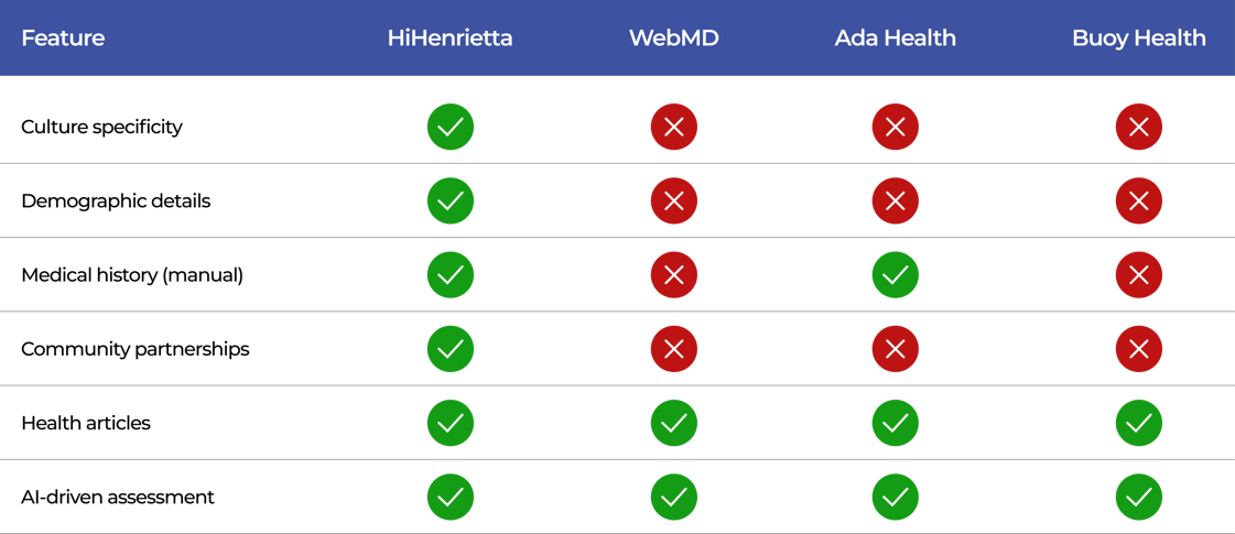
a. Competitive Landscape :
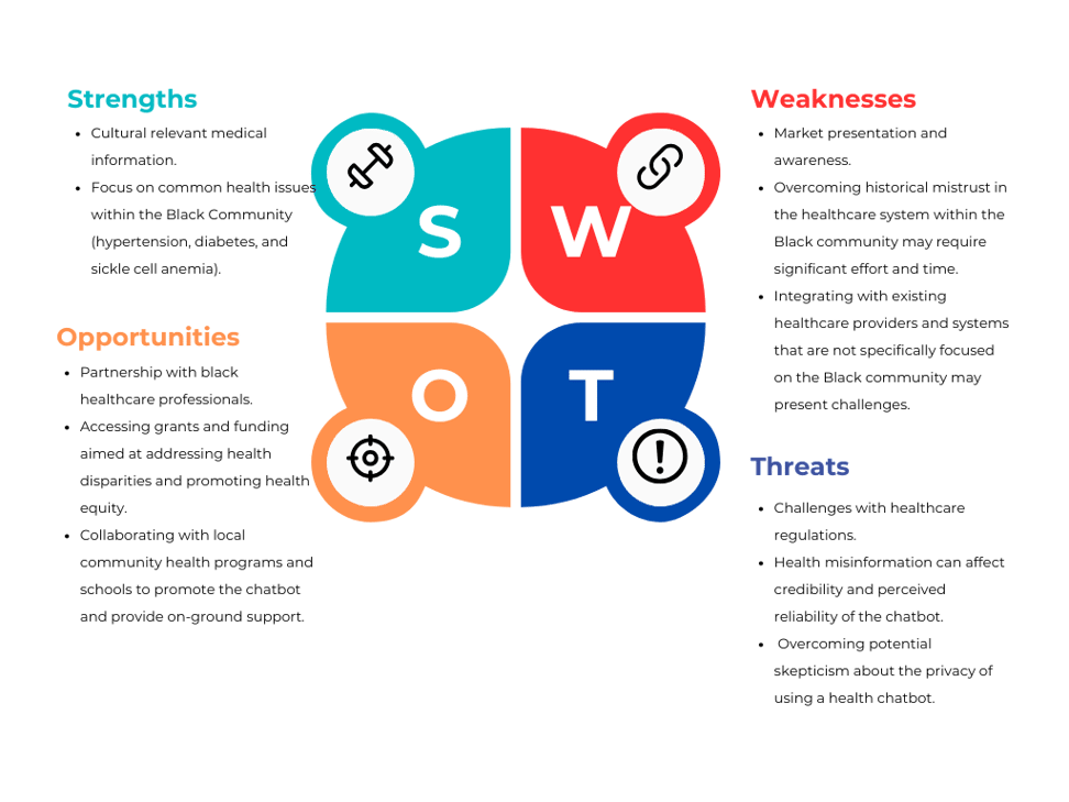
After brainstorming potential solutions, the next step was analysis. By conducting this analysis - including competitive landscape and SWOT - we evaluated how our ideas measured up against market offerings, identified strengths and weaknesses, and refined solutions to better address the user needs.
b. SWOT Analysis :

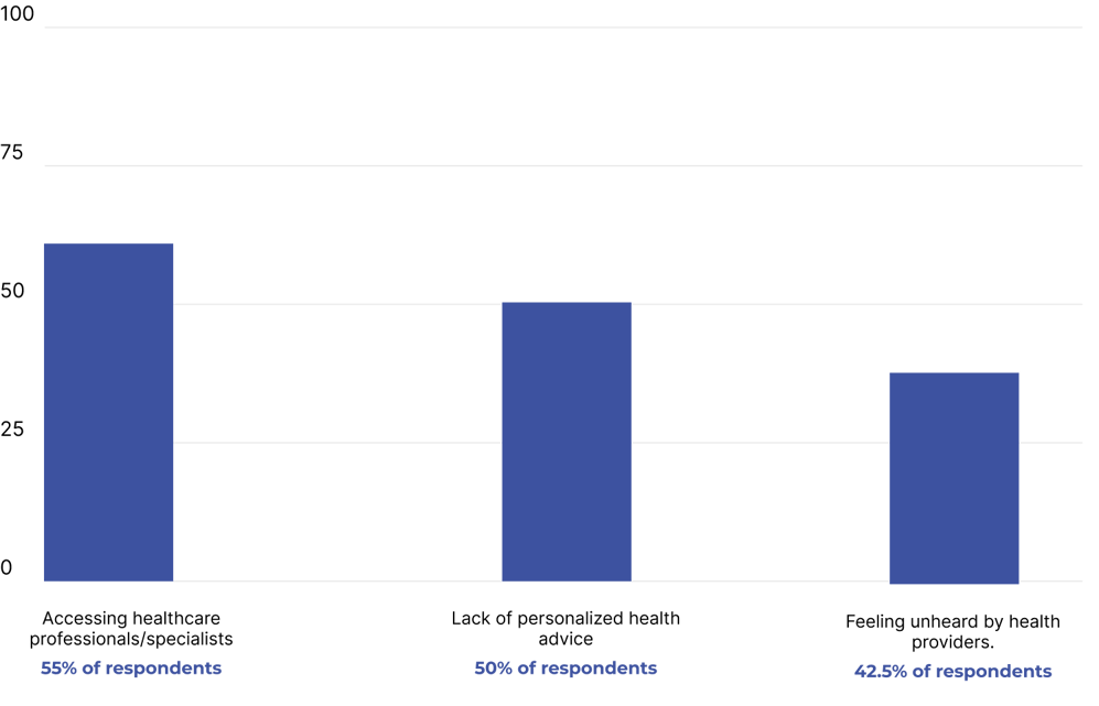


1. CLEAR PATTERNS & KEY INSIGHTS:
2. TOP THREE PAIN POINTS:
1. USERFLOW:
After ideation, a user flow was developed to outline the user journey, detailing key interactions and navigation paths. This served as the foundation for designing screens and interactions.


DESIGN
2. UI DESIGN:
Upon completion of the user flow, we began the UI design with an emphasis on simplicity to reduce cognitive load and improve usability-essential for a health symptom analysis app. We started with sketches and wireframes to define the basic structure and layout, then moved to low-fidelity designs to test functionality and refine the user flow without visual distractions. Once the structure was established, we created a mood board to guide the visual style.
a. Mood board (Creative Direction):


b. Style Guide:
Guided by the mood board, I developed a style guide to ensure consistency and cohesion through out the design.


c. Mock ups:
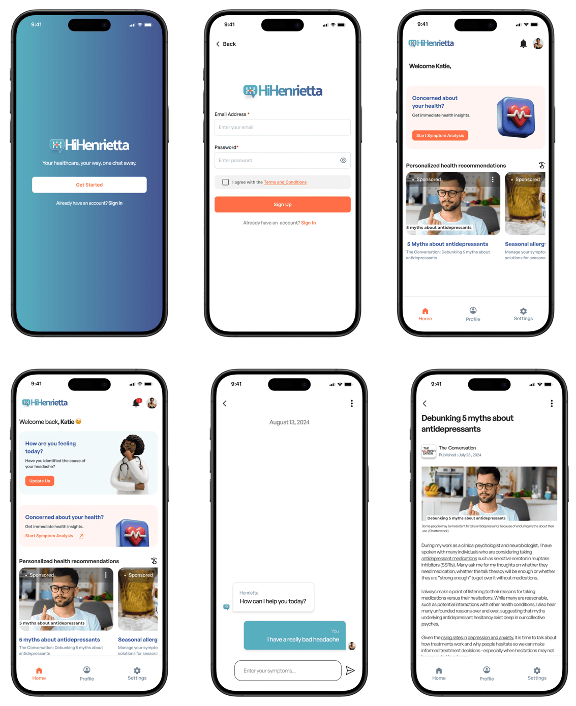

Logo: The HiHenrietta logo features two "H"s joined by an orange, health-style cross within a chat bubble, visually reflecting the app’s mission as an AI-powered symptom analysis tool. The name HiHenrietta is inspired by Henrietta Lacks, whose legacy in medical science underscores the importance of equitable health access and patient advocacy—values that HiHenrietta embodies. The orange cross in the logo emphasizes health and support, adding warmth and accessibility to the design and reinforcing the app’s role as a trusted health companion. The two "H"s represent dialogue and connection, symbolizing the app’s function in assisting Black patients with symptom analysis to better advocate for themselves. This design aligns with HiHenrietta's goal of providing supportive, accessible health guidance, honoring Henrietta Lacks by empowering users to navigate healthcare with greater confidence and clarity.
Fonts : I chose General Sans for the main text and Inter for the buttons to create a cohesive and user-friendly design. General Sans gives the text a clean, approachable look that’s easy to read, while Inter’s clarity on buttons make interactions straightforward.
Colors : A combination of #3D52A0 and #56AEBE on a #FFFFFF background, with #FF6E47 as an accent, were chosen to create a calm and trustworthy main interface. #242124 was used for primary text and #718096 for subheadings to establish a clear typography hierarchy. The #FF6E47 accent adds warmth and draws attention to important areas, enhancing both usability and visual appeal.
PROTOTYPE
I created a high-fidelity prototype to demonstrate the intended functionality of the application, this prototype was later utilized for user testing. Below is a video showcasing the prototype.
TEST
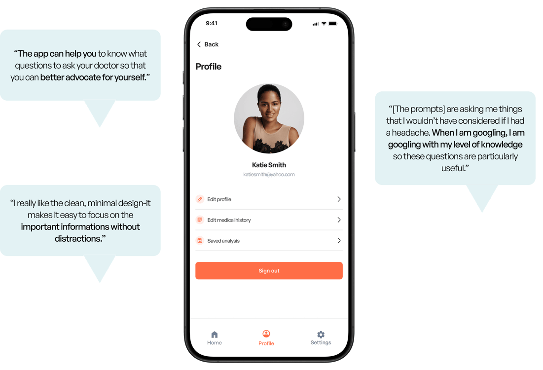

A moderated usability test was conducted with 8 users to validate the product concept and gather feedback on the user experience. Below is what some of the users had to say.
CHALLENGES:
Balancing Detail with User Friendliness: Designing forms to gather detailed medical history and demographic data for accurate analysis was challenging, we had to make them easy to complete without overwhelming users.
Minimizing Input Fatigue: Long forms can lead to user fatigue, where they may abandon the process altogether. We had to consider ways to streamline these forms, so we broke them into smaller steps, using dropdowns, multi-select options and pre-filling common information to reduce the perceived effort.
Ensuring Clarity with the Forms: Users need to understand why they’re being asked for certain personal or sensitive information. We designed the forms with clear explanations for each data point without cluttering the interface.
WHAT'S NEXT FOR HIHENRIETTA?:
Conduct additional usability testing with users to refine navigation and improve the overall application experience.
Collaborate with medical experts to build a verified symptom database and enhance the AI analysis model for more accurate symptom correlations.
Ensure all content is accurate, compliant with regulatory standards, and reviewed by professionals or an advisory group.
Move beyond the current approach of close-ended questions and decision trees by exploring additional AI ethical standards. Ethical implications of the product needs to be considered.
Share revised concept with stakeholders and advisors to gather feedback and identify any final adjustments before development begins.
KEY TAKEAWAY:
I learned the importance of ethical principles in AI design, which led to creating a symptom analysis process based on close-ended conversations and a decision tree. This approach provides clear, consistent and fair results while addressing the ethical implications of AI-driven decisions.


